CSS features that you must start using now
Lets see few amazing CSS tips and tricks that you should know.

1. content-visibility: auto
It basically works like lazy-loading, we can use it for any HTML element but generally we use it for images. When content-visibility is set to auto, elements outside of the visible area will be skipped and then rendered once they appear on viewport.
Not rendering elements outside of viewport makes sense because the user will not initially see the elements that stay outside of their screen, meaning that these elements are unnecessary during the initial page load. So, postponing rendering these elements reduces the initial rendering time so a user can see the content on the viewport faster.
2. @supports
CSS provides @supports feature that allows us to test if the browser supports a particular property or property:value combination before applying a block of styles.

3. Flexbox Gaps
When flexbox was initially introduced we didn’t had any option to specify gap between flex child items. The good news is that we do have this property for flex children now. Check below link for better understanding.
4. font-display
Font-display is used to decide what happens when you custom fonts are loading. Since custom web fonts can take some time to download, the user is usually left with a blank space. We can improve user experience by displaying fallback font and font-display let you manage that.
font-display: accepts 4 options-
:auto: show nothing until the custom font is loaded.:swap: fallback font is shown until the custom font is loaded.:fallback: if the custom font is not loaded after 100ms, show fallback font.:optional: it is like:fallback, but this option lets browser decide to give up if the custom font is taking too long to download and load fallback instead.
5. CSS Variables/Mixins

See the code above, browser won’t be able to understand this and we need preprocessors like SASS, LESS to compile them into css so that browser can understand these.
However, recently CSS has started supporting variables natively without using any preprocessors.
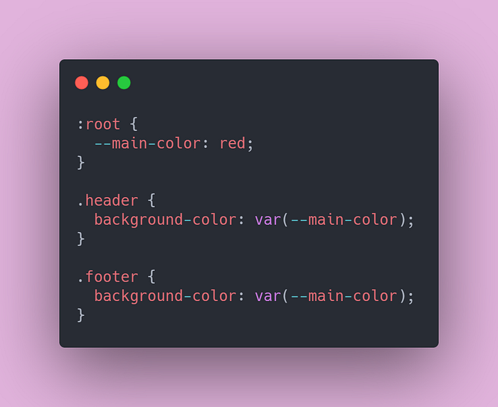
You have to define all the variables in root before you use it in you CSS files.
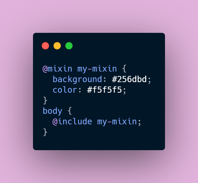
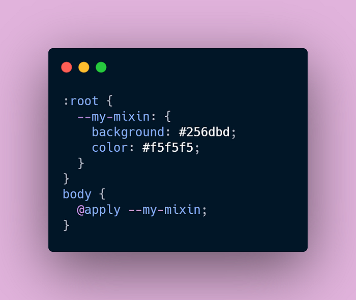
Similarly, CSS now allows us to create mixins also.
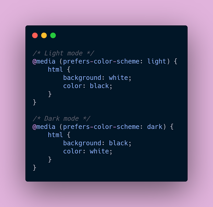
6. prefers-color-scheme
Various operating systems have implemented a native dark mode but that mode doesn’t convert websites to a dark interface, so you’re still getting a bright site regardless of native theme. Wouldn’t it be amazing if websites would also go dark or light based on user’s system preference?
CSS provides prefers-color-scheme which is used to detect if the user has requested a light or dark color theme.
Bonus
A really cool trick I found few days back which is not much related to this topic but its worth mentioning. Sometimes we have a scenario where we need to show a fall back image if our main image doesn’t loads. You can use this simple code below to achieve that.
<img src='img.svg' onerror="this.src='fallback-img.svg'" />I hope you will find these tips and tricks helpful for your future projects. If you know any other interesting tricks , share your favorites in comments section. I will be posting these kinds of blogs on regular basis and if you don’t want to miss on that then make sure you follow me.
